
Monday, 20 December 2010


Friday, 17 December 2010
Front Cover!
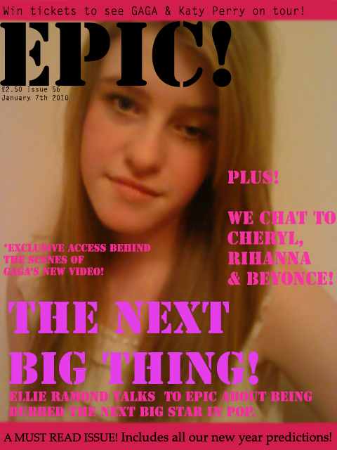
I have decided to not use this front cover as my final cover, as i feel it does not look realistic enough. Also, the layout of the cover lines are not appealing and make the magazine look unprofessional. In addition to this, the image i used as the main photo is blurry and out of focus, and overall the cover is not eye-catching and doesn't stand out.
Thursday, 16 December 2010

Wednesday, 15 December 2010
Images for Front Cover.
I took several images, using my sister as a model, as possible final choices for my main fornt cover image. I took them in different angles to see which turned out best and would look good with the layout of my magazine. the images below are the ones i think would be best suited, the first image being the best one in my opinion. The third image is one i think would look good to include on my double page spread as i think the angle of the shot would be wrong for a cover page image. All the images i took where close ups as i think it would make the audience feel closer to person on the cover.


Although i like the camera angle of this fourth image, the quality of the image came out blurry so i decided to not consider it for my final cover shot.

How music magazines are promoted. (using the internet.)
Most Music Magazines, if not all, use the internet strongly as way to promote their magazine. As digitalization has effected the music industry a great deal, many institutions cleverly plan to use the internet as a way to promote the weekly/monthly issues of their magazines, as it reaches out to a much wider audience and more people become aware of who the main features are, leading to more interest in the magazine.
The magazines promote their product via sites such as YouTube, their own websites, and social networking sites. By doing this they are keep up to date with the way digitalization is moving, and as the target audience is teenagers, the easiest way to promote their magazine to them is by using the internet to promote.
Above is an example of how Q magazine promoted a particular issue, which had Cheryl Cole as an exclusive feature. Whilst filming the photoshoot for the cover, they recorded a behind the scenes feature interview with Cheryl, where she talks about the interview, the concept of the photoshoot, and urges people to buy the magazine.
The images below are examples of how Magazines create their own websites, as a way to keep their target audience informed on the development of the magazine and the features that will be included in the next issues of the magazine. News about Music Artists, Photoshoots, Interviews, Tour Announcements are all displayed on the website, enabling fans to keep up to date on their favorite artists.
I think this is a very effective way of promoting the Magazine, the artists featured, and gaining more fans.


Ideas and Planning. (Price & Audience.)
Genre.
After looking through all the genre's represented by current music magazines, i noticed that are no existing POP Genre music magazines. This brought me to the decision to make my music magazine represent the Pop genre. I also decided on this particular genre because it is currently the most popular style of music, specifically will teenagers, and therefor there would be a good audience to target.
Price.
Taking into account the age of the target audience, the price of the magazine will need to be fairly cheap and affordable for a monthly issue, as the majority of the readers will be students and likely not have an income i think the price would be suitable between £2-£3. By having the price in this range it will ensure the magazine is easily afforable for the chosen target audience of teenagers.
After looking through all the genre's represented by current music magazines, i noticed that are no existing POP Genre music magazines. This brought me to the decision to make my music magazine represent the Pop genre. I also decided on this particular genre because it is currently the most popular style of music, specifically will teenagers, and therefor there would be a good audience to target.
Audience.
As i referred to, when talking about the genre of my magazine, i believe the most suitable social group to aim the magazine at would be Teenagers, particularly females. This is because chart sales show that pop music is the most popular genre of music amongst teenagers, which would obviously make them the most suitable audience to aim the magazine product at. In specific, Teenagers between the age of 14-19, would be more interested in the magazine.
Price.
Taking into account the age of the target audience, the price of the magazine will need to be fairly cheap and affordable for a monthly issue, as the majority of the readers will be students and likely not have an income i think the price would be suitable between £2-£3. By having the price in this range it will ensure the magazine is easily afforable for the chosen target audience of teenagers.
Tuesday, 14 December 2010
Example of a POP music magazine. (X Magazine)
The X Factor magazine is one of very few pop magazines i could find for research and idea's on my magazine, proving my point that there is a huge gap in magazine industry for a pop music magazine. The magazine includes behind the scenes access to the x factor, the biggest music/tv show on TV. It also features the biggest names in Pop music and the currently successful and upcoming new music, with interviews and album reviews. It also includes fashion & style features which suggest the magazine is mostly aimed at a younger female audience, like the target audience i plan to appeal to. The x factor magaizne is an example of convergence used by the music industry. The tv show, The record label (SONY), Technology adverts, Other artists, Fashion, Concerts are all promoted in this one magazine.


Friday, 10 December 2010
Magazine name ideas & meanings
- BIZZ – most current and up to date music, artists and songs currently creating the biggest ‘buzz’ in music industry.
- POP Magazine – connotes that the magazine is representing the most fun, popular & entertaining/ stand-out artists in music.
- EPIC – represents music that is most credited, stand-out, ‘heroic’ music. ‘5 star music’
Out of the name idea's i thought of i concluded that the one i will use for my magazine is 'EPIC' as i think it connotes a strong message about the style of music i want the magazine to represent. The word also stands out, and i think it would be a memorable, and appropriate title for a magazine.
Ideas and Planning (2. Target Audience)
Target Audience.
Based on my my previous planning and research of a suitable genre to represent in my magazine, i came to the conclusion i would promote Pop and R&B music. Therefore the target audience i will aim to appeal to is Teenagers, in particular teenager girls. This is because they are the age category that have the most respect and enjoyment in this style of music and would relate to the artists featured in the magazine.
Based on my my previous planning and research of a suitable genre to represent in my magazine, i came to the conclusion i would promote Pop and R&B music. Therefore the target audience i will aim to appeal to is Teenagers, in particular teenager girls. This is because they are the age category that have the most respect and enjoyment in this style of music and would relate to the artists featured in the magazine.
Thursday, 9 December 2010
Ideas and Planning. (1. Genre of music)
The genres i have chose to represent in my music magazine are R&B and POP music. I came to this conclusion after analysing other magazines and institutions and noticing there are very few magazines that promote these genres of music. I chose to represent two genre's as opposed to one style of music like many current magazines choose to do. This is because, in my opinion, pop and R&B are currently the most successful and popular genre's of music and therefore have a much larger target audience, which would result in the magazine being a success.
I researched many artists that produce music of this genre, and found music video's of the one's i think would best represent/ be suitable to represent Pop music in my magazine and could possibly feature on the cover.
Lady Gaga - I think Lady Gaga is a great example of how much of an impact music has, on teenagers in particular. She currently has the most watched youtube videos in history, a long with receiving a considerable amount of awards, a clear sign of the fanbase she has created with her Pop music. Taking into account her popularity, Lady Gaga would be a good artist to feature on the cover of my magazine as it would be guaranteed to sell exceedingly well.
http://www.youtube.com/embed/qrO4YZeyl0I?rel=0
Cheryl Cole - I think cheryl cole would also be a great artist to represent pop music. Not only because of the huge success of her solo music, but also due to massive fanbase she has created. As she is known as one of the most famous and successful women, currently, in the UK and has great publicity on The X Factor she would confidently promote the magazine a lot, if she featured on the cover. In addition to this, as she is seen as a role model/inspiration to a large number of teenage girls for overcoming aspects of her private life, the target audience i have chosen would also be interested in a feature abotu her in the magazine. Therefor it would be a good idea to have her as teh main feature of the double page spread.
http://www.youtube.com/watch?v=XMiy_UsrPDs
http://www.youtube.com/watch?v=umBmQo_jWO8
Friday, 5 November 2010
Research - Analysis & examples of current music magazines.
To gain a clear understanding of how a music magazine is presented and the layout used on different styles, i found images of several different magazines.
Kerrang Magazine
We can tell instantly from the cover page that Kerrang magazine promotes the genre of rock music. The Band on the cover of the first magazine example have a 'typical look' of a rock band; Long messy hair, tattoes visible, and the certain stance that makes them appear cocky or confident, all features that are generally recognised with the rock genre. The three images below are also of well known rock music artists, straight away telling the reader the type of artists they will be reading about. As Rock music is no longer one of the most popular genres of music, Kerrang magazine have a specific audience that they appeal to.

Q Magazine A
nalysis
The first feature noticeable about this issue of Q magazine is the colour theme used. Black, Red, and white are the only colours used on the cover page and are effectively used to make it stand out and eye catching. The colours are used for the presentation of ; the masthead, the sell line, and the several cover lines. They are also used on the main image, as the hair colour is black and the lips have been particularly decorated with bold red lipstick to continue the colour theme. These three colours create a bold and stand out image for the cover and highlight the lips and eyes on the image, which will appeal to the specific target audience. I think the colour scheme successfully works and would make it one of the most eye-catching magazines on a shop shelf, which would therefore sell well.
The cover page follows the general conventions used on magazines. This is because; All the cover lines are aligned to the left side of the page, with some also on the right hand side of the page. There is also a barcode visible, which is needed, along with the instantly recognisable logo. In addition to this, the main image takes up the full size of the page, with the main cover line in bold at the centre & bottom of the page. The only small difference to general conventions is the use of only one image, unlike many magazines that often display several small images that advertise other features in the magazine. However, I think the cover is more appealing with only the one main image, as the audience will be more intrigued to find out the features of the cover lines that are inside the magazine.
The contents page uses the same colour scheme front the cover page, adding an effect to the magazine through continuity. Along with the colours being repeated, the logo is also displayed on both pages of the contents. Although music magazines usually layout the contents page over just one page, this issue of Q magazine has used two pages. This is an effective format in my opinion as it enables the readers to see the features that will be inside the magazine and decide with will most appeal to them to read.
Using the traditional conventions of a magazine contents page, the layout includes 8 small images and the one main large image for the main feature. The sub headings are in bold black writing, and underlined with a thick red line, making each title stand out clearly, another positive feature of the magazine’s contents page. Each feature is labelled with a page number, intriguing sub-title and information on what the specific feature is about. By setting the contents out this way, the readers will be able to find specific sections quickly and easily, which is a positive factor for both the audience and institutions. The audience because they enjoy reading the magazine and this will benefit the institution of the magazine as the audience will recommend the magazine and could lead to high sales.
The double page spread i am analysing is the interview with 50 Cent. The headline is used to grab the attention of the readers, which it does so, successfully.
‘Who the hell does 50 Cent think he is’. This Title instantly makes the reader ask the question themselves and then they will be intrigued to find out what 50 Cent is really like. The sub heading below ‘the artists also known as Fiddy’ will also intrigue the reader and make them want to read on to see why he has that particular nickname. The feature has been cleverly edited so that there are several questions readers want answering from the interview before they have read the article.
One the second page of the double page spread, they have used a full- page sized image of the artist. The image is taken as an extreme close up, with the focus point immediately drawn to his bold eyes. This makes the reader feel ‘closer’ to the artist and conotates that the article will reveal a lot about 50 Cent. Referring back to the connotations generally used in magazine interviews, there is one quote chosen from the interview which tends to make a bold statement or interesting point of view from the artist. The quote is used to further add to gaining the attention of the reader to the article. In my opinion, the layout of this double page spread is well presented. The headline, using a rhetorical question, is a good idea as it leaves the reader intrigued in the feature on the artist and makes them interested enough to read on. However, the text used for the interview is in extreme small print, which may be an issue for some readers and put them off reading it. Although this part of the double page spread looks fairly boring, i think the image on the opposite page is the strongest convention used and is an effective feature. The close-up angle of the image makes 50 Cent look 'Iconic'.

Conventions and features used on the Cover, Contents Page and Double page spread of a Music magazine.
Front Cover.
- Bar code
- Masthead - bold/eye-catching writing.
- Cover lines - aligned down the sides of the page mostly, sometimes unconventionally at the bottom of the page.
- Main Image - usually takes up full size of the page.
- Several other images in relation to the Cover lines.
- Quotes - taken from the interviews, to interest the audience.
- Date/issue number of Magazine.
- Price. - displayed clearly.
- Font mostly in black and white colours - so they stand out.
- Recognizable Logo. - displayed in the top left corner of the Cover.
Contents Page.
- Title 'Contents'
- Page numbers labelled with pictures and captions for each feature.
- aligned down one side of the page, to make it easy to read and find specific features.
Double Page Spread.
- Eye catching headline.
- Large image, That takes up one full page.
- Several highlighted and enlarged quotes, to interest the audience.
- Kicker.
- Captions
- Introduction to article/ Starter Question.
- Other, smaller images are sometimes used in the interview/article piece.
The Main Task - Brief.
For the main task i have to create a front page, contents page and double page spread of a new college magazine. I will need to research current music magazines for codes and connotations typically used, and then plan the audience, purpose/representation, institution, language & ideology of my own magazine. I will then produce the cover, contents page and double page spread using Desktop Publisher, Photoshop and any other necessary programs to complete the task successfully.
Friday, 22 October 2010
Evaluation
For my Front Cover i used as many codes and conventions i could to make my final product successful. I included a medium close-up image taken by myself, i then added a masthead to the cover 'Wyke Life' and used large/bold font in bright red colour which i feel makes it stand out and catch the eye of the audience. I also included several coverlines on both sides of the cover, with an image accompanying one of the coverlines. I chose these to make the audience interested in wanting to read the magazine.
To correspond with my main image i used a different text to the masthead and coverlines and added the main coverline to the bottom of the page in larger text.
The Institiution of the magazine is Wyke College. As i chose to design the front cover fairly simply i tried to imply that the magazine is produced by other students at the college. The main aim of the magazine is to INFORM the students of the college about current & upcoming events and news of the previous week. To show this i chose to use the halloween party and enrichment courses news to represent that this is the purpose of the magazine.
The audience of the magazine is current students of the school, both female and male. I decided this should be the audience my magazine cover appeals to because the focus of it is to inform all the students of the events and therefore it will appeal to both genders.
By naming the magazine Wyke Life and the final result of the front cover, this conveys to the audience the image that life at Wyke is relaxed and enjoyable for its students and that the institiution are concentrated on keeping the students up to date on everything happening at the college.
Overall i am very happy with the concept of my idea and think the aims i tried to convey were put across successfully and if i was to see the ocver of the magazine as the audience i would be interested to read.
One part of the assignment i was disapointed in, was teh section of my planning. This is because i find it difficult to plan and record my ideas.
Overall i think the cover conveys to the audience that the magaizne is to inform the students, which was my main aim and i feel this was doen successfully.

Contents Page draft.
Using Paint I created a draft of what the structure of my college magazine contents page would look like. I included the heading Contents Page and labelled where I would have the main article picture, and showed that it would be larger than other images on the contents page. I also labelled the page numbers and articles headings on the right side of the page. I then produced a more detailed draft of the contents page in Desktop Publisher. This is how I would set up my contents page:

Ideas and planning – Images for Cover.
I decided that i would like the main article on my magazine cover to be 'Do we really learn better with music?' so i used this idea when planning and taking my images for the front page.
I took several images as a few came out unfocused and blurred. Once i was comfortable with taking good quality/focused images i aimed to capture the ipod used in my image as the main focus by taking the image from a low position, so the ipod appeared larger and close to the screen. I feel that i shot the image well and i am happy with how it turned out.

Final Image
ideas and Planning - Magazine Name Ideas.
I came up with several ideas for a name for my magazine;
-Wyke Life
· -Wyke Bizz
· -Wyke News
· -Wyke Weekly
· -WYke News
The Ones i prefer the most are Wyke Weekly & Wyke Life as i think they denotate to the reader/audience what the magazine is about: To Inform the Students. In the end i decided to use is Wyke Life as it conveys to the audience instantly what the magazine is about and what it aims to inform the students about.
Ideas and Planning. - Who is The Audience?
My magazine will be aimed at Both Female and Male students, aged 16-19. I decided to base my cover on this specific audience because I am planning to use 'general' cover lines and topics that relate to both sexes. Also, i think it is more suitable for the institution of the magazine to aim the product at all students as i decided the meaning of the college magazine is to Inform students of events and news happening in the college during the week of the issue, and therefore this would be the most practical audience for the magazine.
Researching and analysing current College Magazines
To gather a further understanding of the designs used in a college magazine, i found two current magazines produced for students of Grimsby College and East Riding College.
These were;
Grimsby Institute College Magazine
East Riding College Student Magazine
Both magazines have a masthead clear on the cover that tells the reader who the institution behind the magazine is. They both also have a main image that covers the whole page and explains the style of the magazine. Another similarity between the two is that neither charge their students to read an thereforr a barcode is not used on either covers. In addition to this, both use several coverlines on the cover to allow the reader to see what will be readable inside the magazine.
However, there are noticable differences between the two magazines. The East Riding College Student Magazine has only one image on the cover ( the main image) and no additional picture previews of other topics inside the magazine, which could appear less interesting to the audience. Grimisby Institute College Magazine, on the other hand included two additional images to the cover, which i think makes it appeal more to the students it is aimed at. One major difference between the two is the colour schemes uused and how they are presented. Grimsby Institute uses bright blue, oragne, grey and white colours which make it bold and eye catching, in addition to sophisticated. Whereas East Riding College Magazine uses mostly black, with white writing and this, in my opinion, doesn't appeal to the student audience it is aimed at. By using a lack of bold colours it neither appears eye catching, or interesting.
*By noticing this, i will aim to add bold colours to my own front cover so it will appeal to Wyke Students successfully.
The benefit & aim of leaving the East Riding Magazine simple with little anchorage is that it succeeds in bringing the focus of the audience on the main image and not other parts of the cover. I think this has been done very effectively.
The highlight of Grimsby Institute's Magaizne cover is the editing of the main image which has resulted in a cartoon style effect, that i believe successfully draws the interest of the audience immediately.
By analysing and researching these two magazines i feel that my knowledge and understanding of what to include on my own cover has improved.
Notes on codes & conventions used in a College magazine.
*I did some research on the codes and conventions that are frequently used on the cover of college magazines, so i had a clearer idea of what to include on the cover i will be producing.
Masthead – Title used. Often basic, as college magazines are formal and simple & will include name of college.
Main Image – usually a simple image, edited to look realistic and get across point of the magazine. Mid-shot is the most popular camera angle used for the main image.
Main Cover Line – large text explaining to the reader the main feature of the issue.
Cover Lines – Other cover lines, linked with the images (if used on front page) and often placed at one side. Not many used.
Dateline - The date, usually the month and year of publication. If the college (the institution has chose to charge pupils for the publication, then the price will be displayed along with the dateline.)
Teaser - Phrase, thats grabs the readers attention.
Other codes and conventions used are Barcodes, Font, Colour, and possibly Graphics for added effect.
Teaser - Phrase, thats grabs the readers attention.
Other codes and conventions used are Barcodes, Font, Colour, and possibly Graphics for added effect.
Outline of Brief
For this preliminary coursework i have to create the Front Page of a College Magazine and a draft Contents Page. I have to use the programs Photoshop and Desktop Publisher. On the cover i have to include an image of a student in a medium close-up, also including appropriate text, masthead, and additional coverlines.
Subscribe to:
Posts (Atom)