Jessica's AS Media
AS Media Coursework
Tuesday, 29 November 2011
Friday, 21 October 2011
Saturday, 15 October 2011
Further Magazine Analysis
I have analysed another Magazine Cover, Contents page, and a double page spread in more detail to improve my understanding of the codes & conventions i need to use for my own design, to help improve on my previous product designs.
Friday, 15 April 2011
Edited/final version of Double page spread.
I decided to make some changes to the first page of my double spread. I felt the light pink colour i used for the background didn't create enough of a stand out effect and looked quite dull next to the image on the second page of the double speread, so instead i changed the background colour to a bright pink and used a rough brush effect with different shades of pink to make the page look more interesting for the audience. In addition to this i added more text to make the first page of the interview longer, which worked will in improving the structure of the page.
Thursday, 14 April 2011
EDITED contents page.
I decided to make changes on my contents page to improve the quality of my work. i changed the font colour of the page information/text from purple and orange to black as i think it looks more professional and is now easier to read. I also added two new pictures to add more detail to the page an make the appearance look better. i then increased the size of the main feature heading 'Ellie talks about breaking into the pop world' to make it stand out more effectively amongst the other writing on the page. I am pleased with the change si made to this.
Friday, 18 March 2011
Evaluation.
For the task I had to produce a magazine cover, a contents page, and a double page spread. I had to produce this to a professional standard. I did this by researching the conventions of real media products and using them in my own work, learning to use Photoshop to make my magazine look professional, and using blogger to present my work.
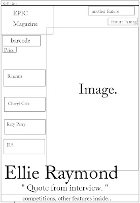
When planning my music magazine I tried to follow the conventions of real music magazines, but decided to incorporate some unconventional features to make my own magazine stand out and different to others, such as not hacving linking text or an image stretching over both pages of the double spread. When researching the conventions, I found that all front covers generally have; a bold masthead in the top left corner of the page, the price and date of the issue, several cover lines (down the left side of the page), main headline supported with a quote, and a barcode. For my own magazine cover I decided to use all these conventions, choosing to not challenge the conventions of magazine cover pages and layout that magazine audiences are familiar with, and also to ensure my magazine looked professional. I used a medium close-up full page image as my main photo, with the model looking directly forward into the camera lens/looking at the reader, this creates a connection between the artist on the cover and the reader, a conventional technique used by real media products. Another way I used conventions of music magazines was by making my masthead/ magazine name easily recognisable and easy to remember using a bold style (Stencil Bold) of font in a bright/eye catching colour pink, a technique used by all current real media products. Keeping to the conventional features, I laid out my page with the several chosen cover lines and quotes down the left side of the page. I decided to follow the general conventions of magazine front covers as they make the product look professionally set out, and in my own opinion i think by using the conventions rather than unconventional features the magazine looks more effective. However, when planning my contents page and double spread i included some unconventional forms and features such as having no link to the two pages of the double spread with text or an overlapping image and instead had the pages as two seperate pages, aiming to make my product differ from others.
I included other conventions of magazines by using a continuous colour theme of pinks, oranges and purples, colours that appeal to my target audience, throughout the cover, contents page and double page spread, making it look House Style. As a way of challenging certain conventions of real media products i produced my contents page using a few unconventional features. Instead of using many small images to introduce some features, i decided to go against this convention and included only a couple of small images and the one larger main image for the main article. I did this because i feel contents pages with too many images can overcrowd the page and make it slightly confusing. Therefore instead i chose to large and bolder text fonts to make it clear to readers where to find certain articles and features. Like real media products i displayed the title ‘contents’ boldly at the top of the page, clearly. In addition to this i aligned all the article titles below the sub-headings of ‘features’ or ‘monthly’, with brief information on the features and quotes, a convention used by most current magazines, to intrigue the reader and to make it easy for the reader to find sections.
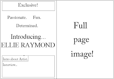
For my double page spread i included the conventional features such as a main title, a quote to assist, an introduction to the article/interview. As well as these, I started the article below the title and introduction to structure the page in the same way as real media products. However, I challenged some conventions by not including any images on the first page of the double spread, and having only writing, as I felt the double page spread looked more effective with only a full-page sized image on the facing page, with a specific quote picked out from the interview.
As my magazine is focused on Pop music particularly, the social group it represents is female teenagers, mostly who have no particular ‘label’ such as ‘emo’ or ‘indie’ and generally follow mainstream trends. I aimed at representing this type of social group in a positive way, much the opposite of how certain older generations generally view them. To positively present this social group i advertised tickets on the cover page implying that teenagers have interests in music and entertainment, and by including features with new young artists, this gives off the image that people of this social group are ambitious and have talent. By also using very well known artists such as Rihanna and Cheryl Cole on the cover, as they are viewed as ‘role models’ in the industry, this social group will be positively represented as looking up to successful artists and idolising their achievements.
The kind of institutions i would expect to distribute and promote my media product would be institutions such as music record stores like HMV, social networking sites and gigs related to the genre of the magazine. As HMV advertises and sells music magazines from all genres of music, my product would stand out if it was to be advertised by the company as Pop music magazines are very rare. With my main target audience being teenagers, the best place for it to be promoted would be the internet, on social networking sites such as Facebook and Twitter, which I discussed in my research and planning posted on my blog. Additionally, another way my magazine may be promoted by an institution is at music gigs, specifically those that are playing Pop music to reach the target audience and at the concerts of the artist I have featured on my cover.
I decided I would choose to aim my music magazine at a female, teenage audience group. I believe that girls between the age of 13 to 19 would be the most attracted to my product. I think this age category would be the most successful audience group, firstly because teenagers are statistically proven to be the largest age category that purchases magazines. I discovered this fact by researching on http://www.marketingcharts.com/, and found that females of a young age (below 24 years) are the age category with the highest statistics of buying magazines. Therefore this further backed my decision to aim my magazine at a younger female audience, as it would be successful and benefit the institution. In addition to this, Teenagers have the most access to the internet, which makes it easier to promote the magazine to wide audience, benefiting the magazine. I decided to particularly aim the product at female teenagers, this is because they are the more likely gender to be interested in Pop music, the artists that will feature in the issue and are more likely to go out and buy a magazine. As Pop music is the genre with most idolised artists, females will be interested too read about their role-models, which is another advantage of aiming my magazine at female teenagers. Although the primary audience will be teenagers, I have also taken into consideration the possible secondary audiences. Parents, particularly mothers, could be seen as the secondary audience, possibly reading the magazine after buying it for their children, or being interested in a particular artist feature they see on the cover. I took this thought into consideration and included some features on the contents page that could also appeal to middle aged women.
To attract my target audience I focused on the features I thought would most appeal to them, based on my own opinions as the magazine is aimed at my age category which Is an advantage. I also thought carefully about the colour themes that are associated with, and appeal, to female teenagers. Features such as Winning tickets to concerts and ‘exclusives’ with highly idolised celebrity artists would interest the audience greatly. I used Pink, orange and purple colours continuously throughout the three products, as they are the colours that generally most appeal to the target audience age, and conotate a ‘girly and fun magazine. To see if my techniques at attracting my target audience worked, i did a questionnaire and asked 10 people for their opinions on my product. One question I asked was ‘does this magazine appeal to you’. Out of the ten people I asked, 7 were within the target audience age category (13-20 years old) and 5 of them said the product appealed to them.
In the process of constructing this product I was introduced to technology programs including Adobe Photoshop and Blogger. I learnt how to use Photoshop to a professional standard and high quality by using the complex tools. When using Photoshop I learnt how to use the ‘blur’ tool on an image to make the model the centre focus and blur the background too effectively make the main focus stand out amongst the text and on the cover page. The techniques I learnt using these programs can be applied to further work I do, and developed more using these technologies.
The preliminary task was a great benefit to me. It was my first time using Photoshop and blogger and therefore gave me the chance to develop skills and practise using these programs to a high enough standard for when I started planning my music magazine. In addition to the technical skills I learnt using these programs, I also learnt how to use a professional camera, taking photos from different angles and in full-focus. When I then went on to producing my music magazine i tried to further develop these skills, although i did this to a certain degree by learning how to post embedded videos and large size images to my blog, when using Photoshop I kept to using the less complex tools rather than developing my skills further using the more advanced tools on the program. However I think my product suits a simpler and less complex style.
Overall, I am pleased with the outcome of my product. Having the advantage of being in the age category for the audience and social group my magazine is aimed at, I think I have successfully used all the conventions and features to attract my audience. Although I feel my contents page does not look as good quality as my cover page the audience feedback I collected showed that the page was structure well, as 8 of the 10 people I asked said the contents page was presented well enough to find specific articles. The double page spread I produced along with the cover of the magazine were my stronger products, in my own opinion, as they followed the conventions of real media products and the continuity f the texts and colour schemes were effective.
Wednesday, 16 March 2011
Audience feedback.
Questionnaire
Does this magazine appeal to you?
Do you think this magazine looks a professional standard?
Is the font a large enough size or too small to read?
Is the contents page presented well enough for you to find certain articles you are interested in?
Can you tell who the target audience is, by looking at the front cover?
Do you think this magazine would stand out amongst other magazines?
Would you buy this magazine regularly? Weekly? Monthly?
Do you think the price is reasonable for a monthly magazine, aimed at consumers that will have a small income?
Can you instantly tell what genre of music the magazine represents?
Would you say the social group this magazine is aimed at, is represented positively?
Friday, 11 March 2011
Thursday, 10 March 2011
Wednesday, 9 March 2011
Tuesday, 8 March 2011
New Images.
Although i have already done a cover page for my music magazine, i decided the images i used were not a good enough quality to use, and so i have taken some new images that i think are better quality and shot from better camera angles.
Monday, 7 March 2011
Interview i am planning on using for my double page spread.
When i was planning idea's for the interview i will include on my double page spread, i looked at interviews from several artists in different magazine, to get an idea of the format and type of questions that are asked. I also looked at how the artists replied to the questions, and how they manage portray a positive image of themselves in the way they answered the questions.
This is the interview i made up to be used on my double page spread.
Interview for double page spread.
This is the interview i made up to be used on my double page spread.
Interview for double page spread.
Hi Ellie! Firstly we’d like to say how much everyone at EPIC magazine already love you! ...
So many artists in this industry are wrongly perceived; describe yourself in four words, how you want our readers to see you..
So many artists in this industry are wrongly perceived; describe yourself in four words, how you want our readers to see you..
Ellie: Well, I’d say I am very passionate, fun, and definitely determined! Humble as well; my friends always tell me they believe I will keep my feet firmly on the ground, even when I become a ‘big star’ *laughs*.. which is very important to me, I hope the public can see I am down to earth and normal like everyone else. Hopefully people can relate to me!
Interesting!
And what about your highly anticipated new album? Which songs are you most excited about fans hearing?
Ellie: I’m really proud of my album, so much hard work has gone into making it and it’s turned out better than I hoped! I’m so so excited about everyone hearing all the songs on the album. But BraveHeart, Tomorrow, and Free are the one's i think are the stand out songs. I really hope everyone loves the whole album as much as I do!
We can’t wait to hear it! If your album is successful (which we know it will be!) would you think about planning a tour?
If, *Fingers crossed* the album is successful, I would definitely love to tour! It has always been my dream to get the chance to share my music with people that can appreciate it, so to go on a tour would be even more than I could wish for! Watch this space! *smiles*
Turn over page for more from Ellie..
Monday, 20 December 2010
Subscribe to:
Comments (Atom)


